Themes
Bibliogon ships with six color palettes, each available in a light and a dark variant. Pick the palette under Settings > Display; toggle light and dark with the sun/moon icon in the sidebar.
Available palettes
Warm Literary (default)
Warm cream and brown tones with Crimson Pro as the serif typeface. Bibliogon's original palette, evoking classic print on paper.
Cool Modern
Cool blue-grey tones with Inter as the sans-serif typeface. Clean, modern layout for authors who prefer a sober look.
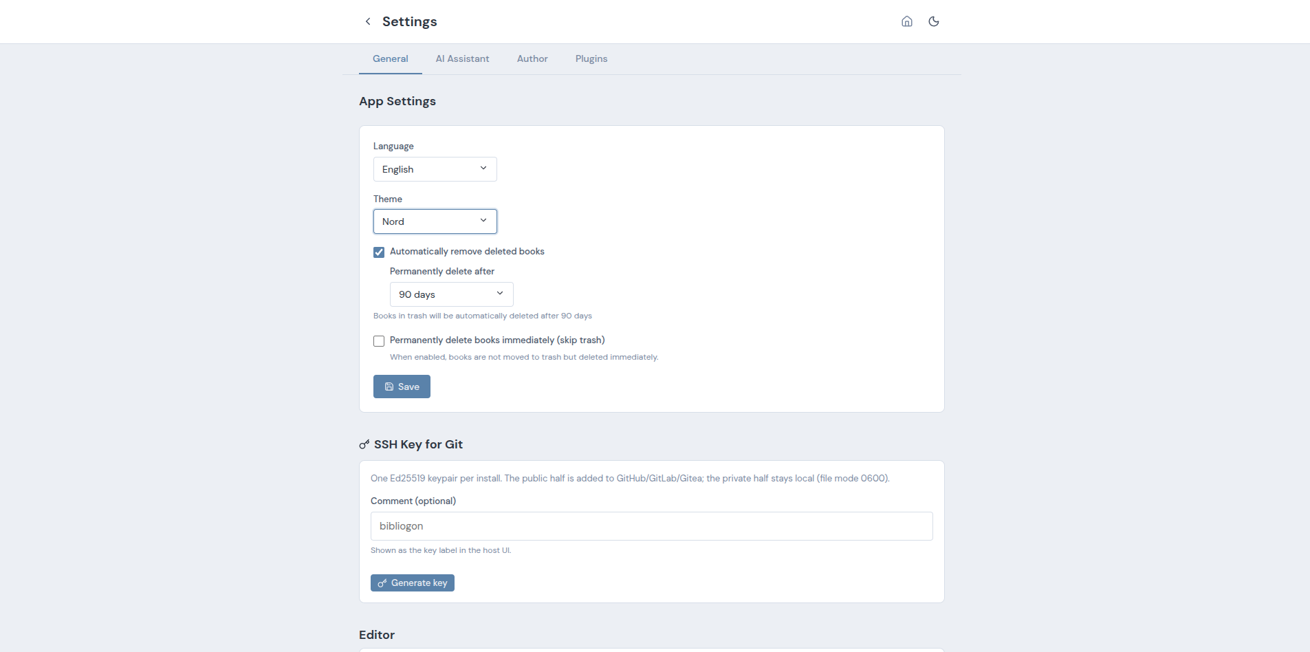
Nord
The popular Nord palette, adapted for Bibliogon. Muted pastel tones suited to long reading sessions.
Classic (new)
Paper-like feel with warm beige and cream tones and a bordeaux accent. Serif typography (Crimson Pro) everywhere - editor, sidebar, UI. The editor additionally renders a first-line indent on every paragraph except the first one after a heading, following the typographic convention for literary prose.
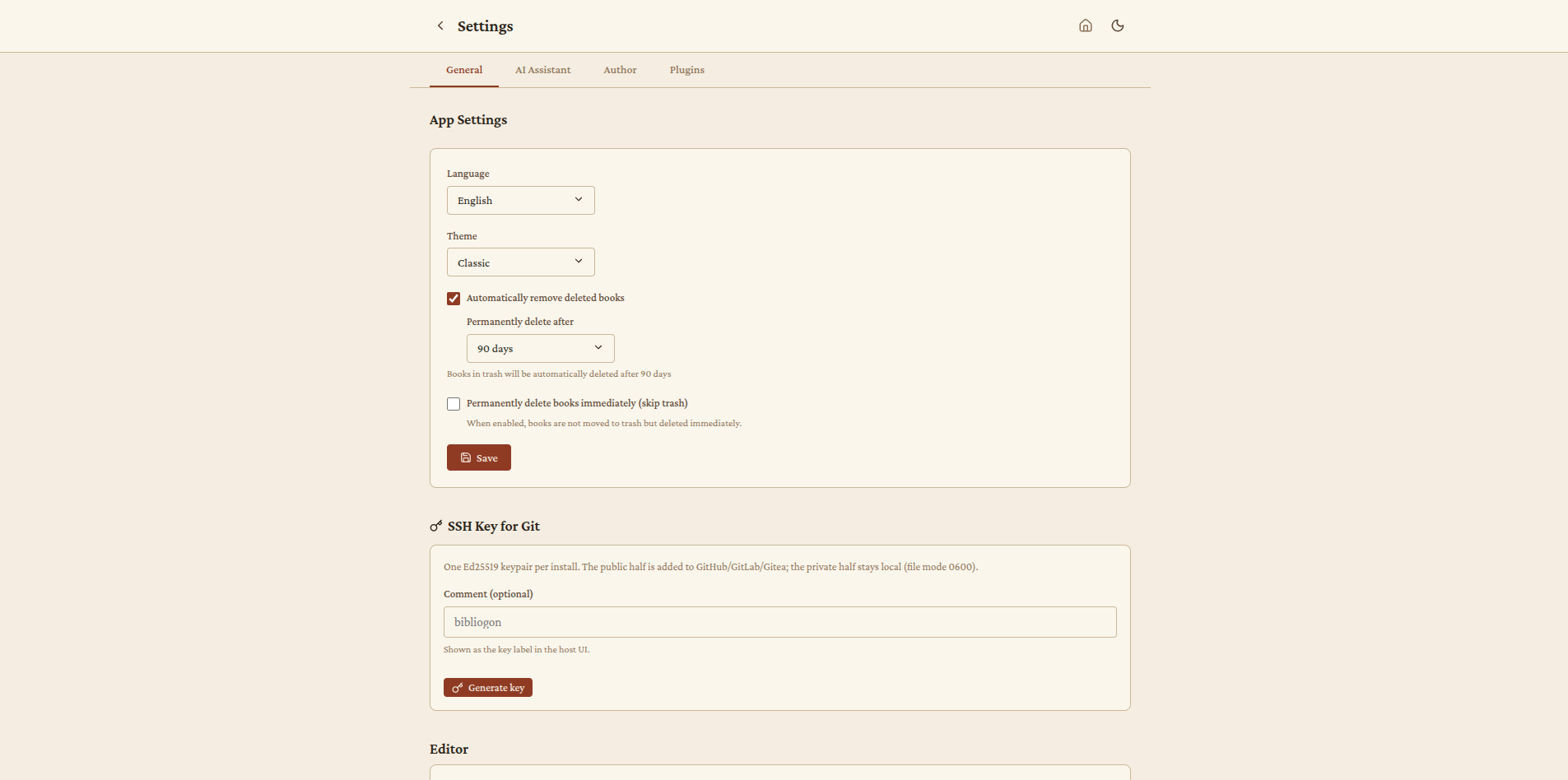
When to pick it: literary writing, novels, fiction. For authors coming from paper-like tools.
Studio (new)
Dark, professional look with high contrast and a mint/teal accent. Visually inspired by professional audio/video editing software. The light variant applies the same accent to a muted light-grey canvas. Inter for UI text, Source Serif Pro for headings.
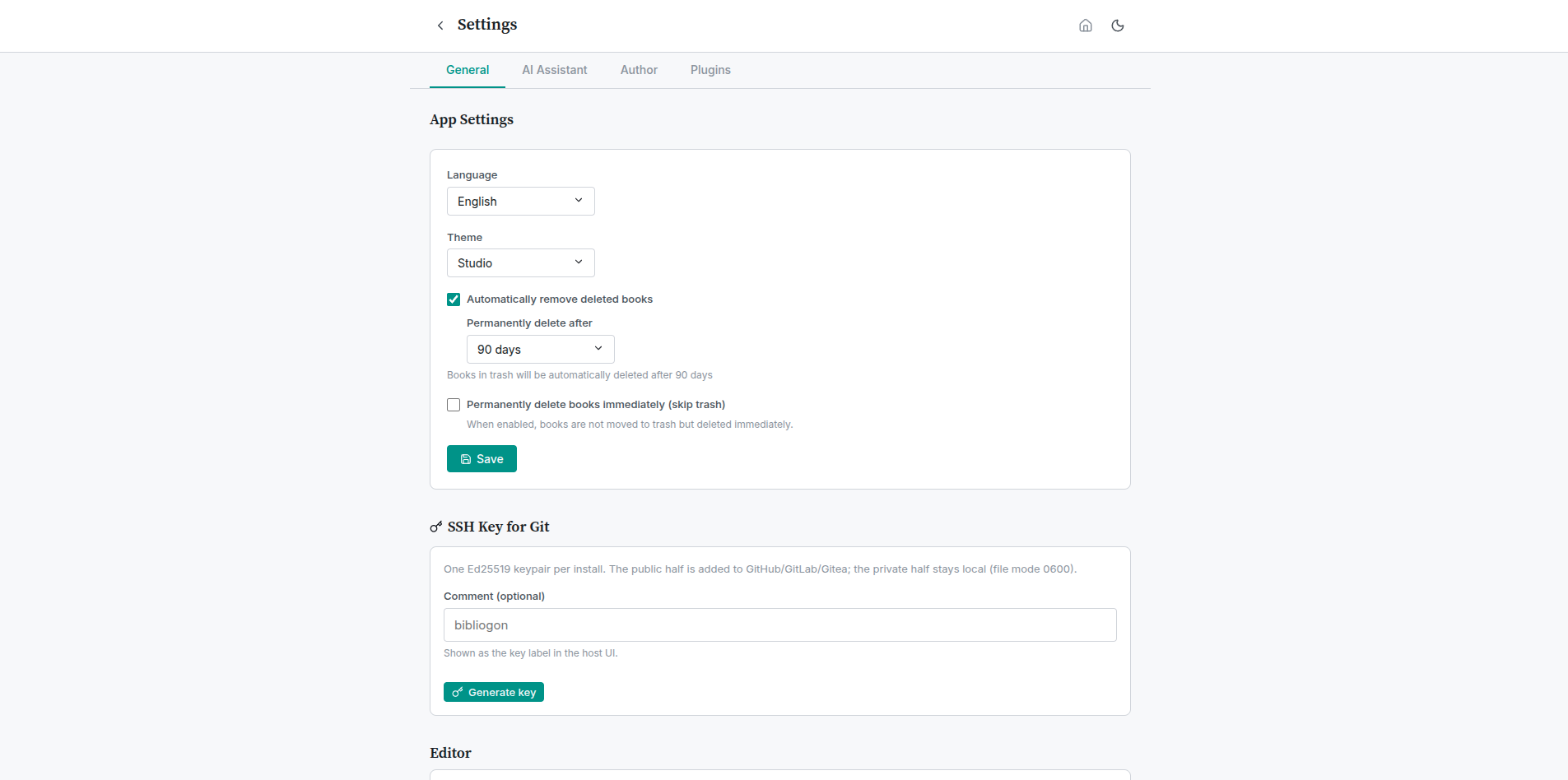
When to pick it: long writing sessions with minimal visual distraction. Power users working for hours at a stretch.
Notebook (new)
Light paper with a ruled-lines look, like a notebook page. The editor gets subtle horizontal lines (1.6em line-height) and a red margin line down the left side. Lora as the serif typeface. The dark variant keeps the same lines with adjusted colors.
When to pick it: handwritten writing feel, brainstorming, notebook-style workflows.
Light/dark variant
Each of the six palettes exists in a light and a dark variant. Light/dark is independent of palette choice - clicking the sun/moon icon toggles light and dark while keeping the palette intact. The two dimensions combine into twelve total theme variants.
Technical notes
- All themes use the same CSS variables. Plugins that contribute UI can support every theme without additional work by using
var(--bg-*),var(--text-*),var(--accent),var(--border),var(--shadow-*)instead of hardcoded colors. - All fonts are bundled locally (O-01 completed). No external font services are contacted.
- The theme selection is persisted in browser
localStorage(bibliogon-app-themefor the palette,bibliogon-themefor light/dark). On first launch Bibliogon follows the system preference for light/dark and defaults the palette to Warm Literary.